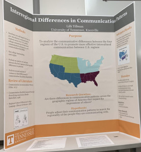
Throughout college, the majority of students will have to do some sort of presentation of their work and/or research. Even though giving a presentation of your work can be stressful, it is beneficial to know a few helpful pieces of information that you can use for any poster presentation.
Poster Boards
The most common way that research is presented in an academic setting is by way of poster boards.
For The University of Tennessee, students can print posters from the studio in our libraries. For others, check your local FedEx, UPS, or even craft stores for large poster printing.
Before you get to printing your poster, you need to know how to design and format your poster. For UT students there is a poster board template that already has some options designed for you. For others, the easiest way to format your poster board is through Powerpoint. Here are some instructions from the UT libraries to help you figure it out. There are also lots of poster board templates online you can use.
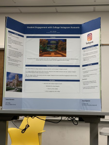
Once you have your poster formatted, the fun part of designing and adding in visuals comes in to play! Here are some tips and tricks from students who have made posters in the past:
- Make sure your poster can be read from a distance. People are going to be standing around 4-5 feet away from you, so keep this in mind.
- Refrain from using colored text. If your text is a nice black, it will be much easier to read.
- Refrain from using text that is not easily readable. Keeping a font like Times New Roman, Georgia, or Arial is best.
- Be sure to evenly space out any graphics you may use on your poster. You don’t want too many words in one place without a graphic, so make sure no part of your board looks crowded with words.
- Make sure the photos you use are large enough so that they do not look pixilated when they are printed.
- Refrain from using bright colors for your header, footer, or background. Colors like yellow or neon colors are distracting and hard to look at.
- Try to make sure no words fall into the creases of your poster board. Organize the board into 3 sections: the left, the middle, and the right. Keep in mind that the audience will probably look at the top and center first, then go to the left side of the board, and then the right. Use this knowledge to plan which information should go where on your board.
- Do NOT use too many words. Try to keep everything to bullet points. After all, you are going to be presenting your information verbally and you want the audience to listen to you and not be squinting at your poster the whole time. Your poster is merely a visual aid, so use it to enhance what you are saying.
Once you are done designing your poster, it is time to print and glue!
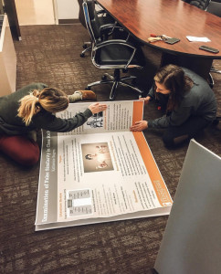
The poster itself comes on a piece of paper. Therefore, you must glue your poster to a board so that it can stand upright. With that being said, the best poster board to buy is a tri-fold foam board. Foam adheres glue much better than cardboard to the poster, so it will have a much more clean and professional finish. You don’t want your poster falling off your board the morning of the presentation! It is also a good idea to give yourself plenty of time to glue your poster onto the board; it can be very time-consuming to get the poster adhered correctly.
The best glue to use on your poster and foam board is a glue stick. School glue or watery glue will cause the poster to have bubbles and appear to be crinkled.

Here is an example of a poster board that used cardboard and school glue instead of a foam board and glue stick. Notice the wrinkles and bubbles.
Here is the same poster on a foam board and adhered with glue stick. Notice how there are far less bubbles and the board looks much smoother.
Now that the poster is ready to be presented, make sure that you keep it in something that will keep it safe and dry from the elements when you transport it to your presentation location. You don’t want rain to ruin your board that you worked so hard on! A simple black trash bag should do the trick.
Presenting Your Research Poster
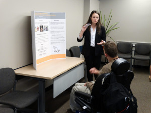
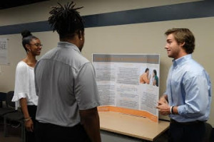
Presenting a research poster is similar to giving an elevator pitch. Research presentations are usually a more informal way for researchers to share their findings. One usually has five to seven minutes to give a summary of their research before the audience moves on to the next poster board. Within this five to seven minutes you should discuss:
- The purpose of your research
- What you are measuring
- How you are measuring it
- Why it matters
Since this is your work, keep in mind that you know this information better than anyone else! Because of this, there should be no need to look at your poster board while presenting unless referring to a graphic. Do not read from your poster!
Lastly, ask the audience if they have any questions or suggestions. You are surrounded by your peers. They are interested in your work and may have some great ideas on how you can improve. That is one of the main reasons we present our research in the first place.
